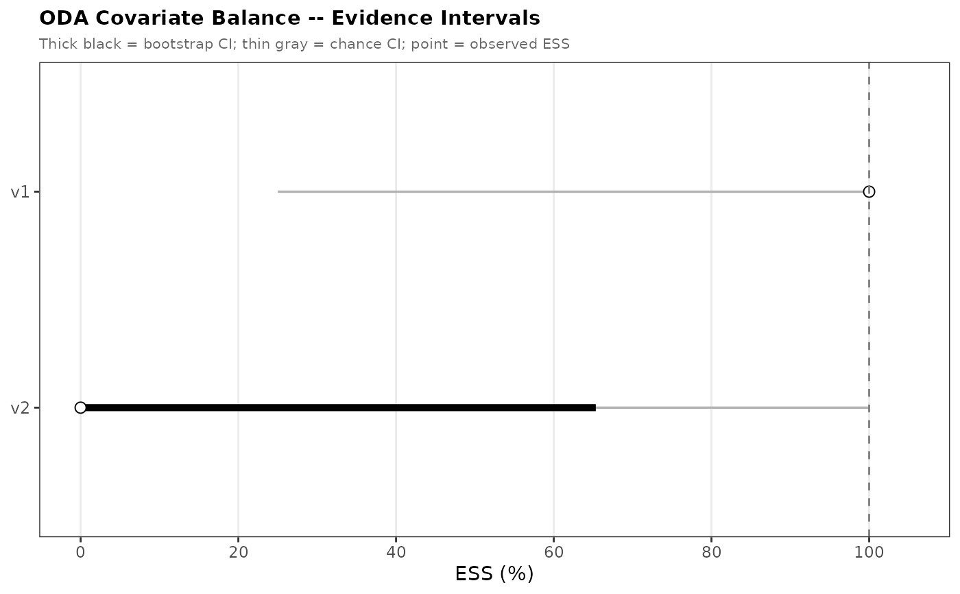
Forest plot of ODA covariate balance evidence intervals
Source:R/graphics_v3.R
plot_oda_balance_effects.RdRenders a forest plot from an oda_balance_effect_table object.
Each covariate is displayed as one row. A thin gray segment shows the
chance (null) confidence interval; a thick black segment shows the
bootstrap model CI; a point shows the observed ESS/WESS. A vertical
dashed line marks the chance upper bound (chance_hi) as a visual reference.
Arguments
- x
An
"oda_balance_effect_table"object.- main
Optional character; plot title. Defaults to
"ODA Covariate Balance -- Evidence Intervals".- subtitle
Optional character; plot subtitle.
- x_label
Optional character; x-axis label. Defaults to the metric label from the data (
"ESS (%)"or"WESS (%)").- xlim
Optional numeric(2); x-axis limits. Auto-computed when
NULL.- ...
Ignored; reserved for future use.
Details
When the object contains multiple analysis scales (e.g.,
compare_weights = TRUE), the plot is faceted by analysis.
This function does not fit any models. Pass a pre-computed
oda_balance_effect_table from oda_balance_effect_table.
Examples
# \donttest{
group <- c(0L, 0L, 0L, 0L, 1L, 1L, 1L, 1L)
X     <- data.frame(v1 = c(1, 2, 3, 4, 5, 6, 7, 8),
                    v2 = c(0L, 1L, 0L, 1L, 0L, 1L, 0L, 1L))
et <- oda_balance_effect_table(group, X,
                                nboot = 50L, chance_iter = 50L,
                                mc_iter = 200L, mc_seed = 1L)
plot_oda_balance_effects(et)

# }
# }